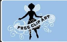
There is a beautiful blog that I enjoy called The Graphics Fairy
It is filled with graphic images that readers can use for projects they are making. I find it to be wonderful since the old prints, paintings and drawings are just great to look at, even if they aren't used to make something.
I wanted to thank Karen, who writes the blog, for taking the time to allow so many of us to share the images, by making her this small plaque with her fairy logo on it.
I found this picture in the banner on Karen's website and copied it to my computer.
(Please note that this image, unlike the ones Karen posts, is copyrighted, it was designed for her. I am using it here with Karen's permission, but would not use it to make and sell anything, it's only for her use.)
I then printed the image in the exact size that I was using it, which was for a pine plaque of about 5 1/2" x 5 1/2".
There are two ways to go about removing the wood from a project like this.
For this one I left the highest parts untouched and removed away all the rest. then I went to the next highest parts, and so on.
You have to decide what parts you want to be in relief (stick out) from the others. I decided on four different levels or heights. The highest (sticking out the farthest) would be the ribbon and border, second highest would be the fairy and third highest would be the wings. The background would then be the lowest level.
Using the print out I traced with carbon paper, the ribbon and the border only.
Using my little trim router I removed just a small fraction of wood from everywhere outside the lines of the ribbon, and up to the border:
After that step I drew in the fairy and set the router bit lower and hand routed out everything else behind her:
The next step was to do the wings:
It was time to clean up the mess with a little bit of sandpaper, lightly used as well as a fine chisel in places where I didn't get close enough to the shapes I wanted.
I painted the plaque, trying to match the colours in the original logo as well as the swirl patterns. I put black around the sides, which you don't see in the photo, because her logo is surrounded by a white border and then a black one.
Also, the writing on the plaque doesn't say "Free Clip Art," as I wanted Karen's name on it. I wasn't sure of the font used, but did try and copy the style, for the letters "KAREN" as you see in the finished plaque.
After finishing the painting, I just wasn't sure if I wanted to leave it like it was, or to distress it. Knowing, from Karen's blog, that she liked distressed things, as I do, I did distress it by scraping it up with some sandpaper in a few spots.
This photo gives a better idea of what the plaque looks like in person. You can see the different levels of the parts. It really does look cool... and original!
I mailed off my creation to Karen a few weeks ago. She emailed me to thank me for the small gift.
Again, I thank HER for such a beautiful and inspiring blog!
Linking up at some of my favorite blogs:
The Graphics Fairy
Funky Junk Interiors
Under The Table and Dreaming
Perhaps you'd like your blog logo, or family name, or anything, done in raised routering. Please contact me for pricing if you'd like me to make you one.

Labels: router


